LightSwitch is quite flexible when it comes to displaying data in grid. You can even use your own custom Silverlight controls, that you can build according to some rules, but when you need it, it’s there. Nice to feature, when all out-of-possibilities fail.
In this small post I will try to elaborate on built in controls and how to tweak them.
I will start with small sample project, that you can download if you want to dig deeper on you own pc.
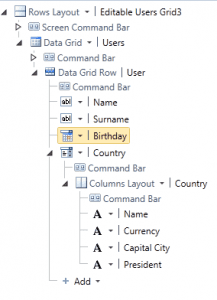
Some good old grid in Lightswitch can look like this :
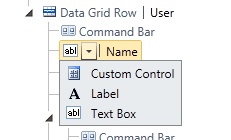
Here you can see some sample data. Every node in Data Grid Row means it will be 1 row in a grid. You see icon and then name of each property like Name, Surname, etc. With small dropdown you can select type of control Lightswitch will use when displayed so for example when you need to display something read only, then you can select to display label.
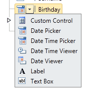
Types that will Lightswitch display are dependent on type of property. When you have DateTime property, you will have more choices :
When you need some column as read only you can use Date Time Viewer in this case.
OK, now comes the tweaking.
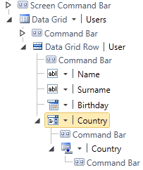
When you reference another table, then your screen can look like this :
This is the default, but you can change it. Choosing type next to Country (in this case of course) will result in what you see when you see just grid. In this default case it will look like this :
But maybe you want to display a grid in cell of this main grid. OK, just change default to columns layout and you will have this :
Your users like rows better? OK, here you go :
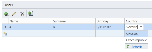
Say you want a quite requested feature : you need combo box, but when you click on it, you need grid. OK, here we go :
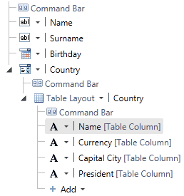
Set country type to Auto Complete Box but change also underlying type to grid. The way it works in Lightswitch is that you can control what to see in grid by changing node on Data Grid Row level, but change in underlying level will change what you see once you click on down arrow of Auto Complete box. And this can be also table layout. This is how it looks like in editor :
This at runtime :
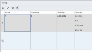
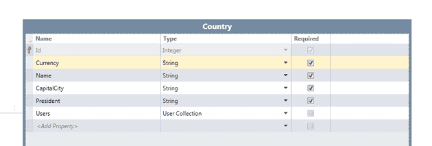
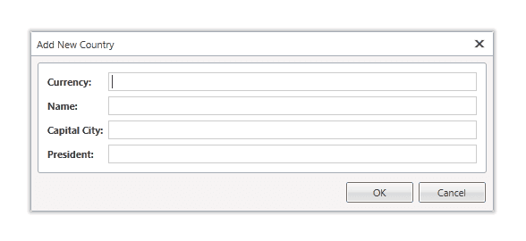
OK, now to another common task with this grid, that will also affect something else. Say you want to display not Slovakia or Czech republic in the grid for selected item, but something else. How to set it? Well, “use the force Luke” :), but we will use model. Lightswitch is written so, it will mind order of properties when we created model. This order is preserved in auto generated window for adding, editing and removing items but also it will take first property and show it here. So once we change model (I moved Currenty to top) like this :
It will change also this :
and this :
So please be aware of that.
Last things that I would like to show you are modal windows.
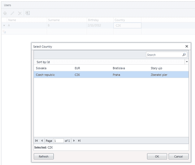
Say you need a picker to choose from some another grid, you you can user a Modal Window Picker and in the picker you can have a grid (table layout) and it will look like this ion grid :
and with open popup :
Or just plain old button that will open window properties of current record we want to edit in different controls. Picture text box with very long text. You can add button behind this column to open popup window that will have only one textbox, but that will be multiline and that will enable users to edit this long text more user friendly.
If you have any questions, feel free to ask, or mail me.
Solution can be downloaded here :
https://skydrive.live.com/redir.aspx?cid=78a5783de37d2ebe&resid=78A5783DE37D2EBE!1786&parid=78A5783DE37D2EBE!1779&authkey=!AE2rYVVr0I8FBww and look for ComboApplication.zip file.
Hope this helps.
